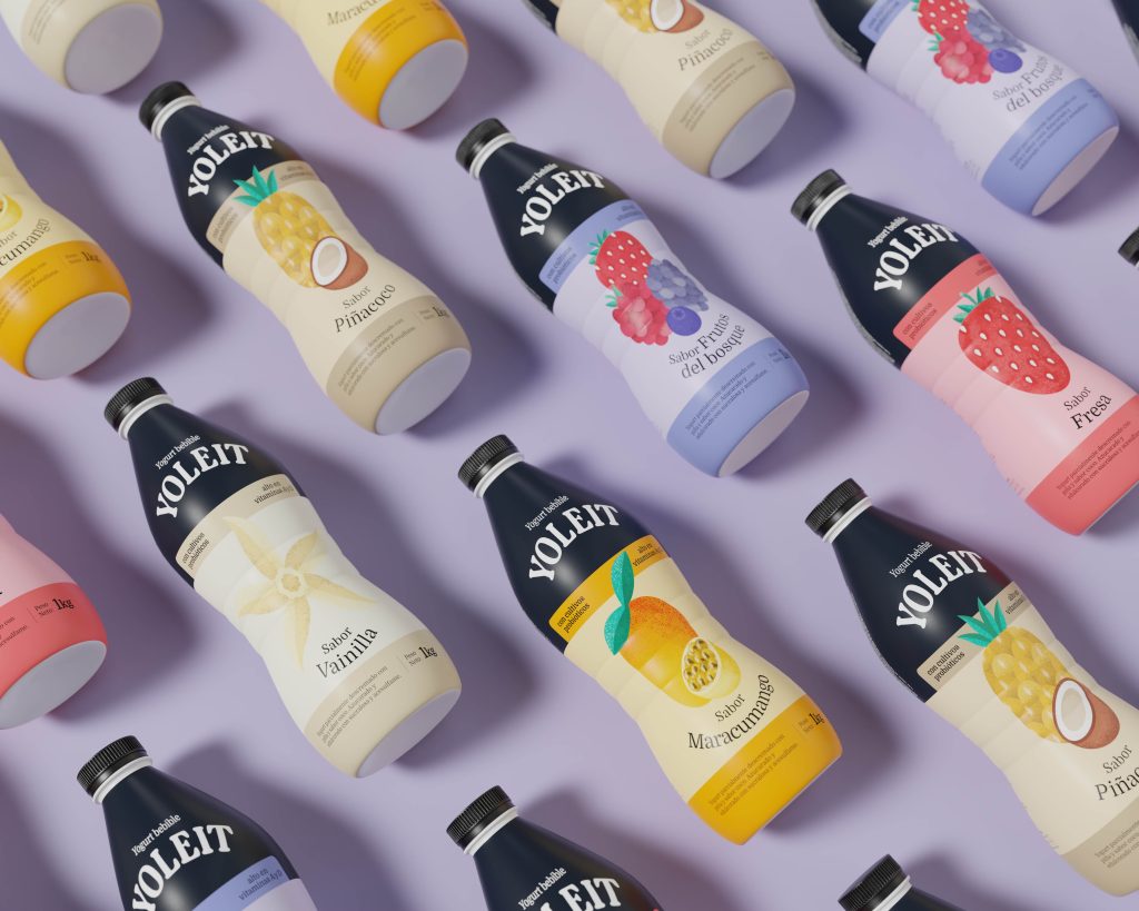
Yoleit

(+51) 919 297 524
Av. San Martin 674,
Barranco - Lima, Perú
Clarity and Focus: San Carlos’ New Visual Identity
Servicios:
Branding Aplicado, Sistema Visual
Rubro:
Alimentos y bebidas
What makes you recognize a brand? Is having a logo or packaging people are familiar with enough?
When San Carlos reached out to us, we realized that without changing its essence, but by adding a few key elements, we could make the brand much easier to identify.
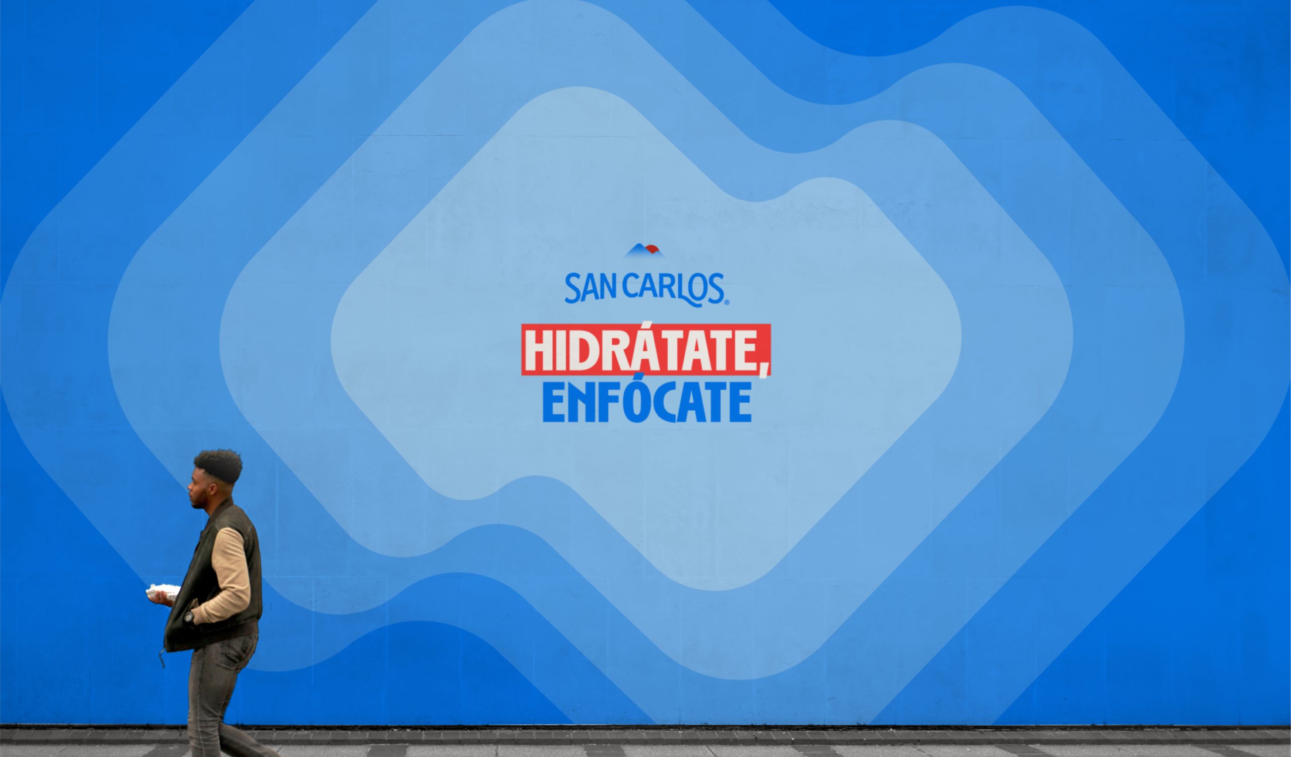
We started with a concept inspired by what humans feel when drinking water: clarity and focus. It’s proven that the brain doesn’t function the same without proper hydration—even memory can fail.
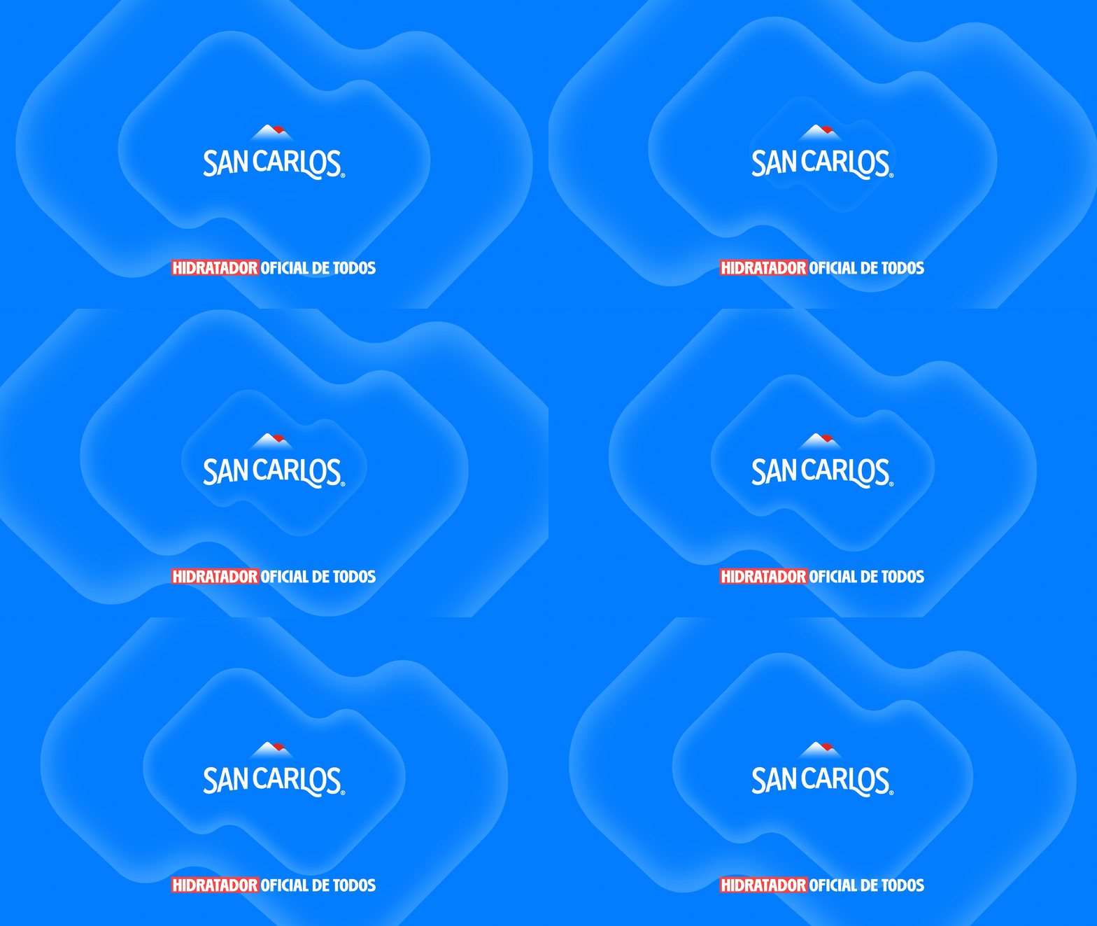
That insight led to a visual system based on concentric shapes that evoke a sense of focus. This system gives the brand an easily recognizable element that can be applied to any communication material.
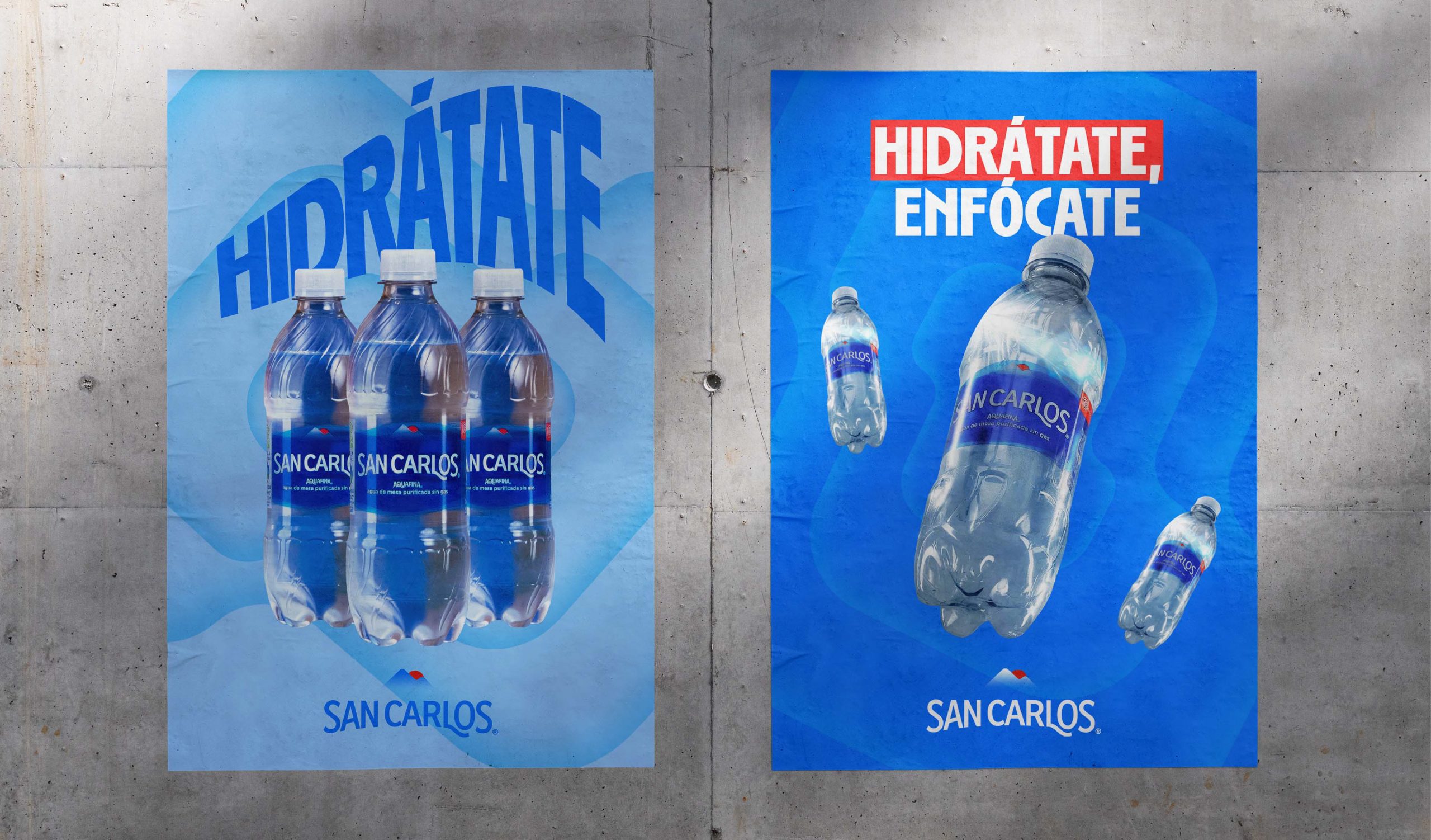
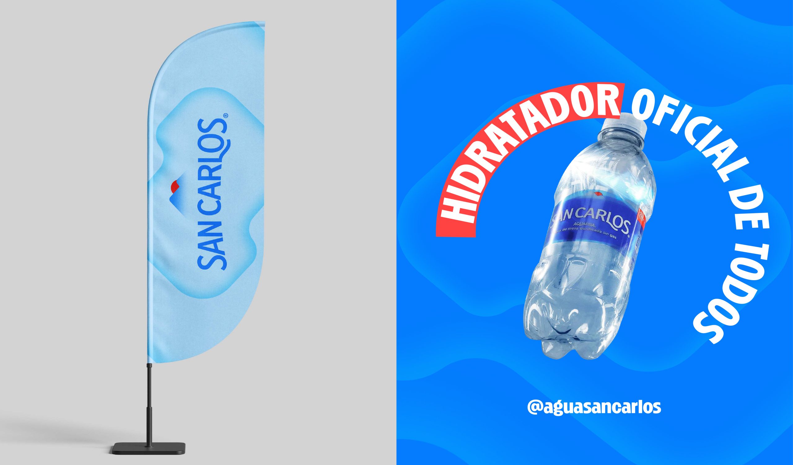
San Carlos didn’t need to change, but in order to design all its communication pieces—like billboards, shelf displays, or social media content—it was essential to introduce new visual ingredients.
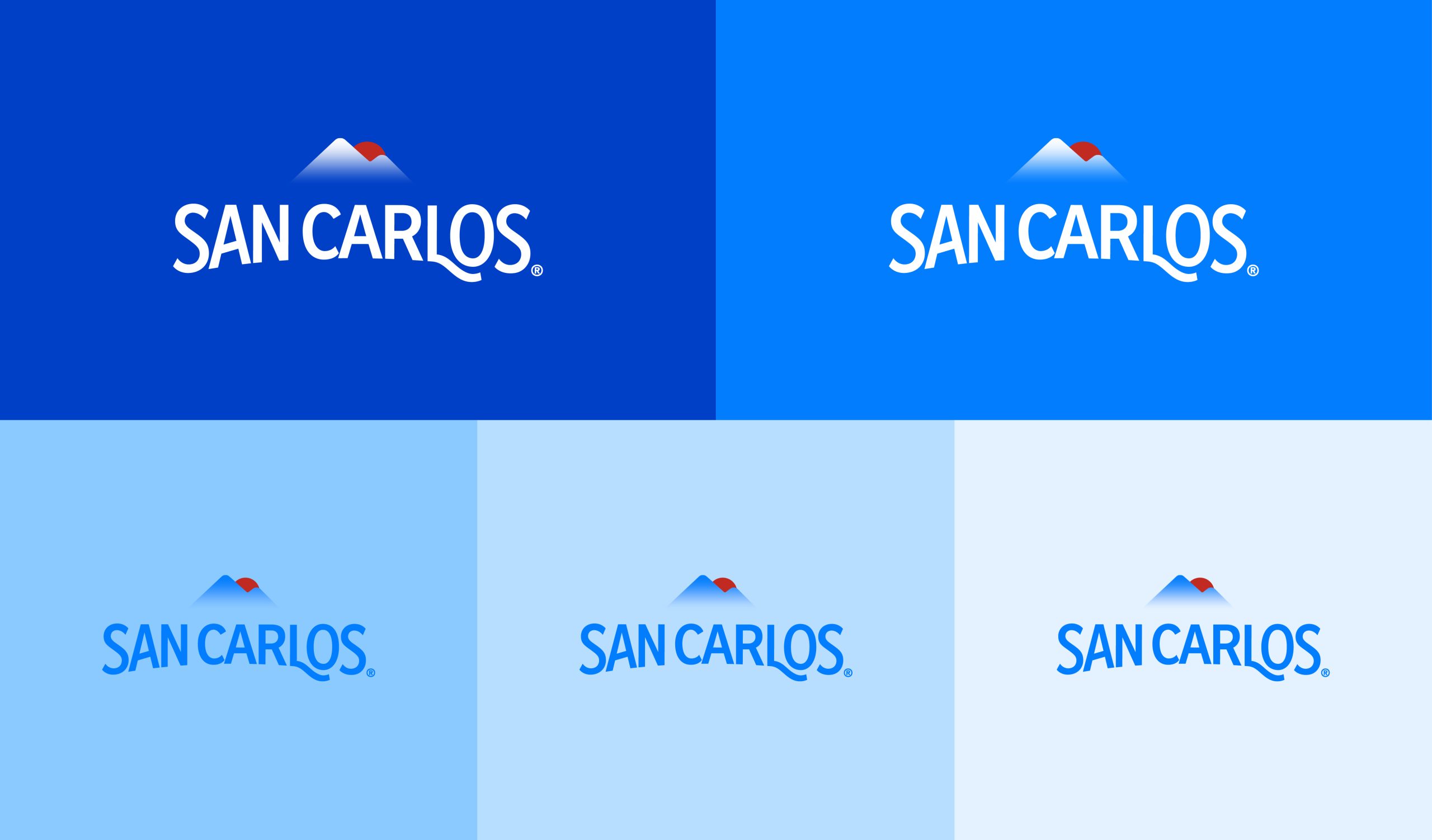
Visual identity is often confused with a logo, but the logo is only one part of the system. With these new elements, San Carlos now has a much stronger and more recognizable visual identity.





Yoleit
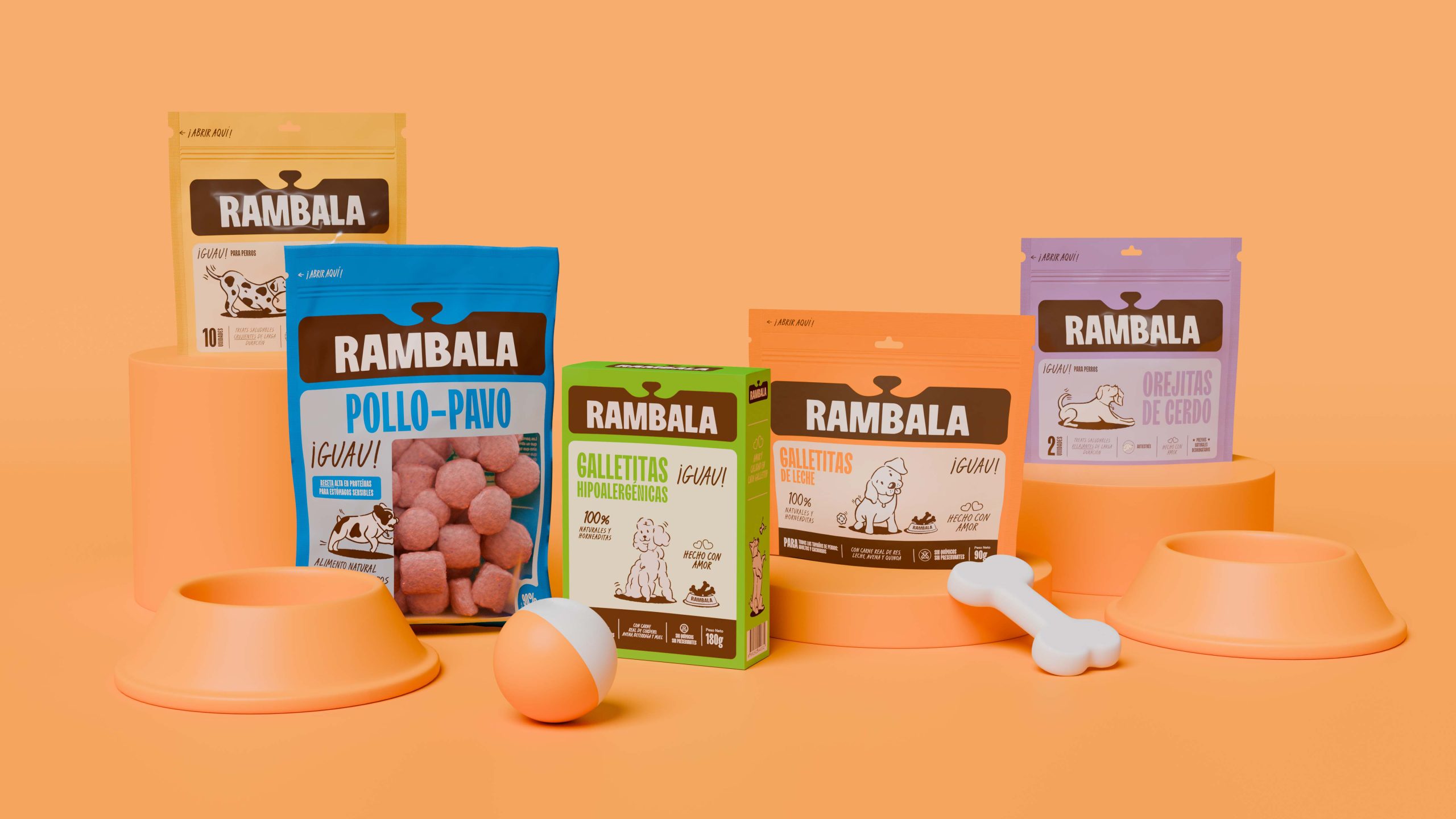
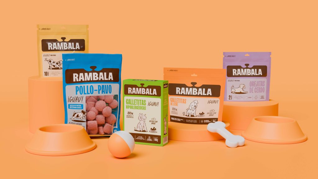
Rebranding y packaging de Rambala, alimento para mascotas
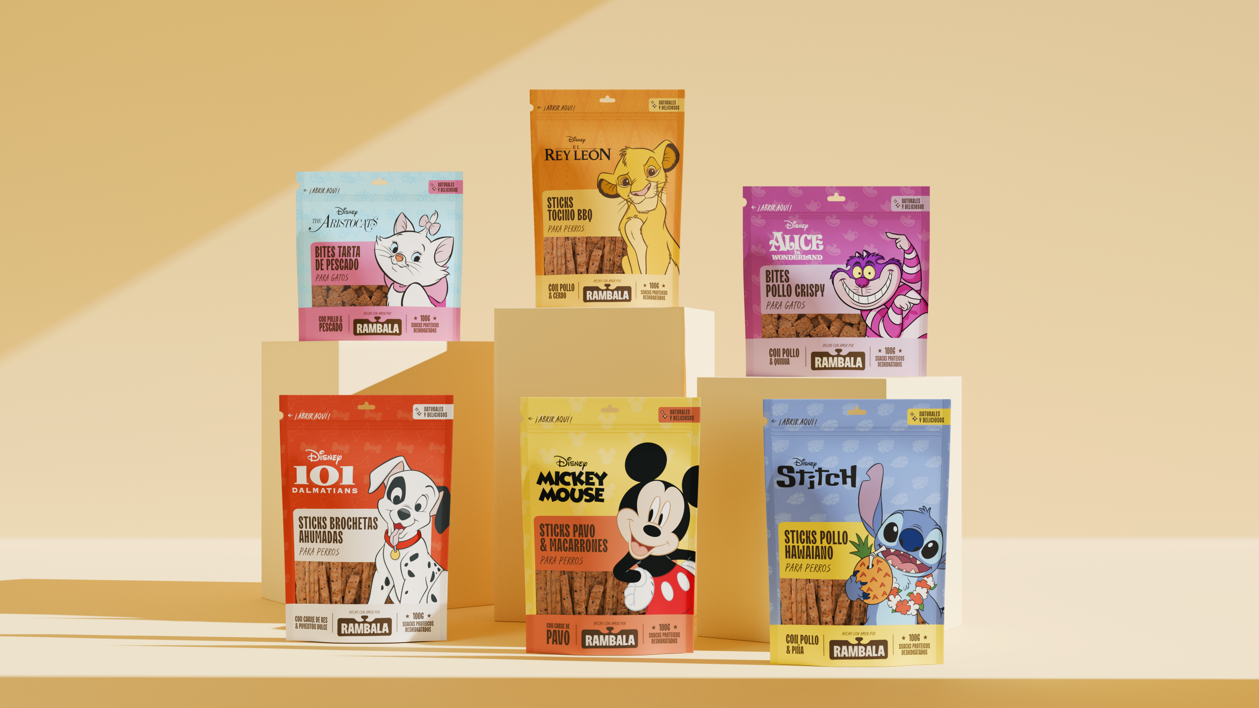
Packaging de Rambala Disney, alimento para mascotas
(+51) 919 297 524
Av. San Martin 674,
Barranco - Lima, Perú
Si vamos a trabajar juntos, probablemente no siempre estaremos de acuerdo. Y eso es una buena señal. Las mejores marcas nacen de las mejores conversaciones.
(+51) 919 297 524
Av. San Martin 674,
Barranco - Lima, Perú
Si vamos a trabajar juntos, probablemente no siempre estaremos de acuerdo. Y eso es una buena señal. Las mejores marcas nacen de las mejores conversaciones.